


I have the honour of making letterings for Kyrkpressen, a Christian weekly paper in the Swedish speaking part of Finland. Every week I get a text with thoughts on faith and life. Every week I get to interpret the text into a lettering. I've made my firsts ones, got nine more to go. It requires thought, a lot of drawing and making mistakes. At least for the first one.
I want to show you how I work, what my process is like. Note: this is not the lettering that appeared in the paper, this one I rejected. I get to decide which one I want in print.
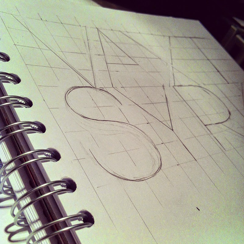
Firstly I sketch my ideas with pencil, mostly in my notebook or just on ordinary printer paper. I mostly sketch free hand, but this one needed a grid.
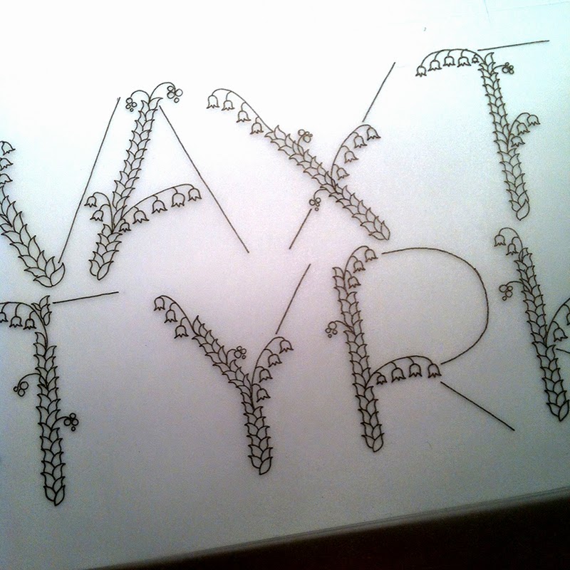
Then I used tracing paper, a semi transparent paper, to make a first pencil drawing of the letters with the details I wanted. I chose to draw Lily of the valley as decorations on the letters. I'll tell you more on why I chose a flower later.

I was happy with the pencil sketch so I used a second tracing paper to trace my letters with ink.
I mostly vectorize my letterings. That way I can change the size and smaller details or kerning. I do not start from scratch drawing the letters in Illustrator, I use Image Trace on my drawings, (with some work in Photoshop before opening the project in Illustrator). It is a very time consuming job, but I like the process.
Here is the first coloured draft. Växt-styrka is growing strength in English. I noticed the dots on the Ä, second letter from the upper left, were not obvious enough, so I remade them.

But then I hesitated because "växt-styrka" is not a real word in Swedish, so I remade the whole second part of the word into "kraft". Växtkraft (growing power) is a more common word.
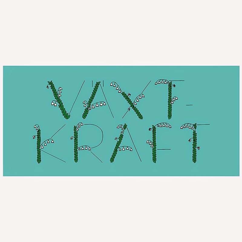
I really liked how the letters looked in the "växt-styrka" version. More exspressive letters and better flow in the layout. I am happy with the result, but I did not want it in the paper so I drew a whole new one for that.
I chose Lily of the valley because in flower language the flower stands for woman power and innosence. Also "I´ve loved you from the first time I saw you" and ""Get to know me before you judge me". To me these meanings go well with values on growth in a Christian sence.
Here is the lettering I sent off to be printed in the paper:

I have not seen the paper myself, since I live in Sweden, but soon enough I can read it on the web. Here is the archives for the past papers. The lettering says: "God - burning letters or a still breeze". The lettering is based on a text written by Mia Anderssén-Löf, who is a pastor in the Lutheran Church in Finland.
Hope you enjoyed taking part in my process. Please, do not hesitate to ask if there is something you-re wondering about when it comes to lettering!


No comments:
Post a Comment